AI Product Design 0 โ†’ 1 Web App

Designing the future of self-improvement through conversational AI

Led end-to-end UX and UI as the first designer at Habit Coach AI, building the onboarding experience, habit tracker, design system, and chat and voice AI flows from zero.

Role
End-to-end UX & UI ยท Design System
Timeline
Q4 2024 โ€“
Q1 2026
Tools
Figma ยท Amplitude ยท Cursor AI ยท Airtable
Team
CEO ยท CTO ยท PM ยท 4 engineers ยท UX writer
01 โ€” Overview

What is Habit Coach AI and why does it matter?

Habit Coach AI is a 24/7 AI-powered accountability companion that helps users build habits through proactive phone calls, conversational tracking, and personalized coaching. Think of it as a personal coach in your pocket: one that actually reaches out to you.

When I joined as the first designer, the product had early functionality but no design foundation. The experience was inconsistent, the brand had no identity, and trust signals were missing entirely.

My role
First and only designer. I defined the interaction model, built the design system from zero, redesigned onboarding, created the habit tracker, chat UI, voice experience, and all marketing assets.
02 โ€” Problem

Users dropped off before they ever saw the product

The core onboarding asked users to enter a phone number and continue via SMS, with no context, no trust signals, and no explanation of what the product actually does. For a habit-building app, that's a fatal first impression.

Beyond onboarding, there was no visual habit tracker (data lived in Google Sheets), no design system, and inconsistent UI across every touchpoint. 95% of users dropped off before experiencing anything.
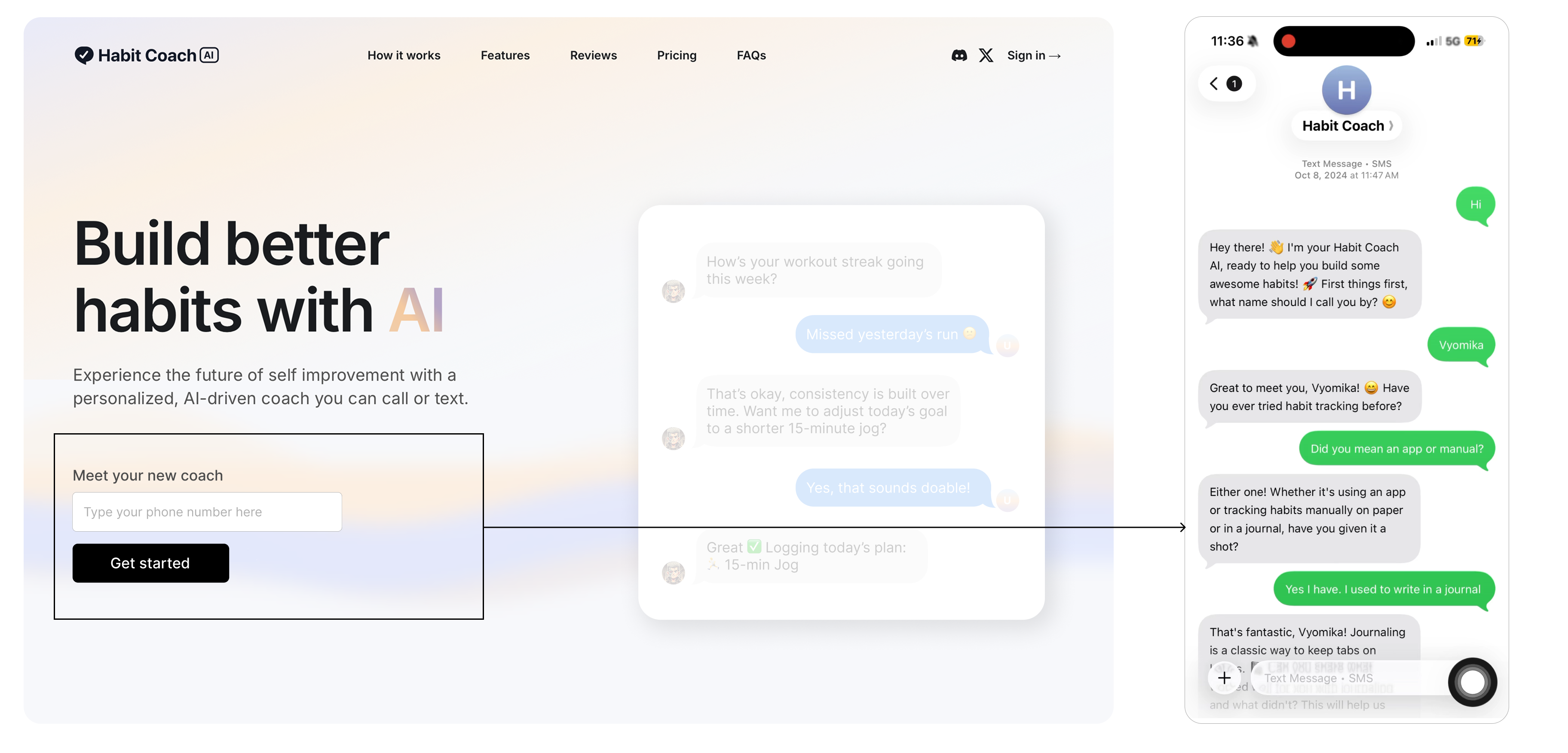
Before state: SMS onboarding with no context
03 โ€” Role & Responsibilities

First and only designer. End to end.

I was brought in as the founding designer with no existing design system, no brand guidelines, and no design process. Everything was built from zero alongside a fast-moving engineering team.

Onboarding & Activation
Redesigned the signup flow from scratch. Reduced drop-off from 95% to 34.2% completion through 3 iterations.
Habit Tracker
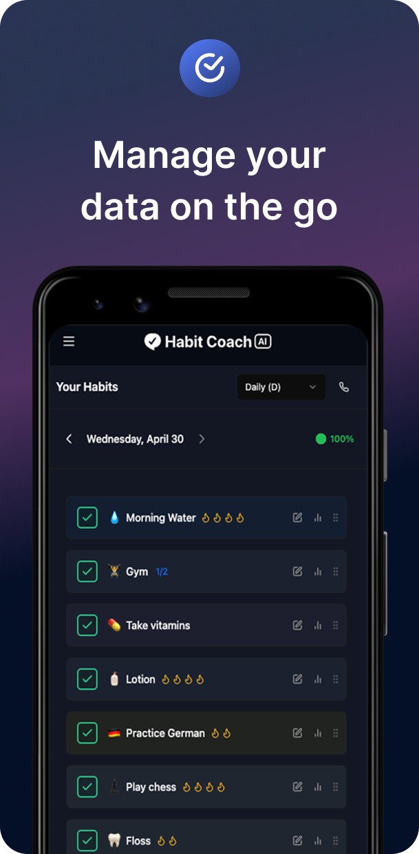
Designed the visual tracker, calendar view, streaks, light/dark modes, and emoji personalization.
Design System
Built the full component library in Figma: tokens, typography, color, and interactive states.
Voice & Chat UI
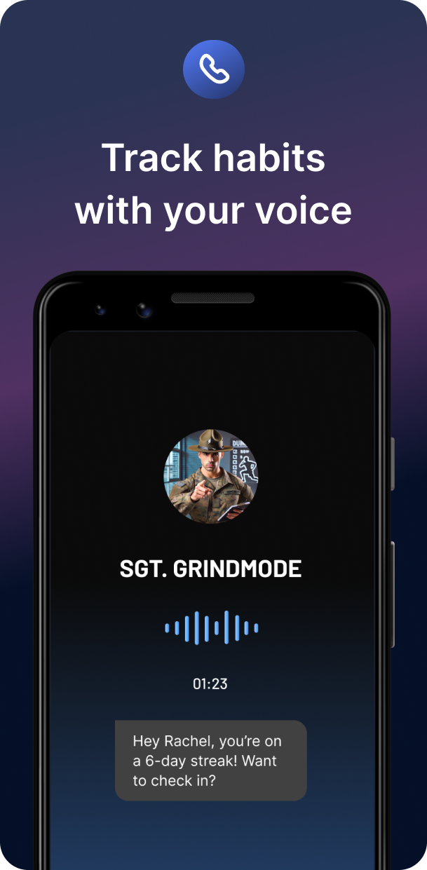
Designed the AI coach call experience and chat interface, the core daily touchpoint of the product.
Marketing & App Store
Created ads, App Store screenshots, and landing pages that drove paid acquisition.
Process & Tools
Set up Figma, Airtable, and Amplitude workflows. Introduced design review and critique processes.
04 โ€” Research & Insights

Three patterns that shaped every decision

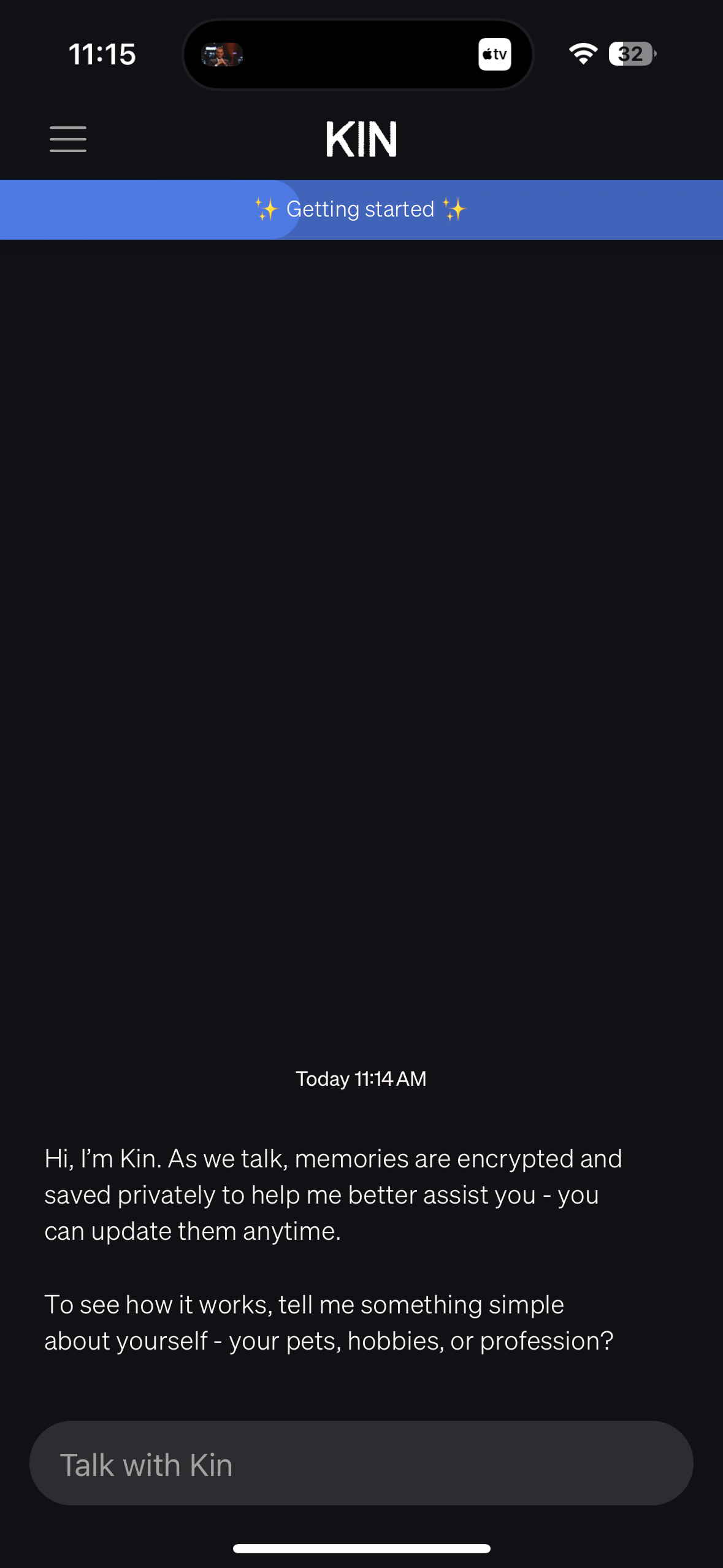
I combined Amplitude drop-off data, user feedback sessions, and competitor analysis to identify what was failing and why. Three themes emerged consistently.
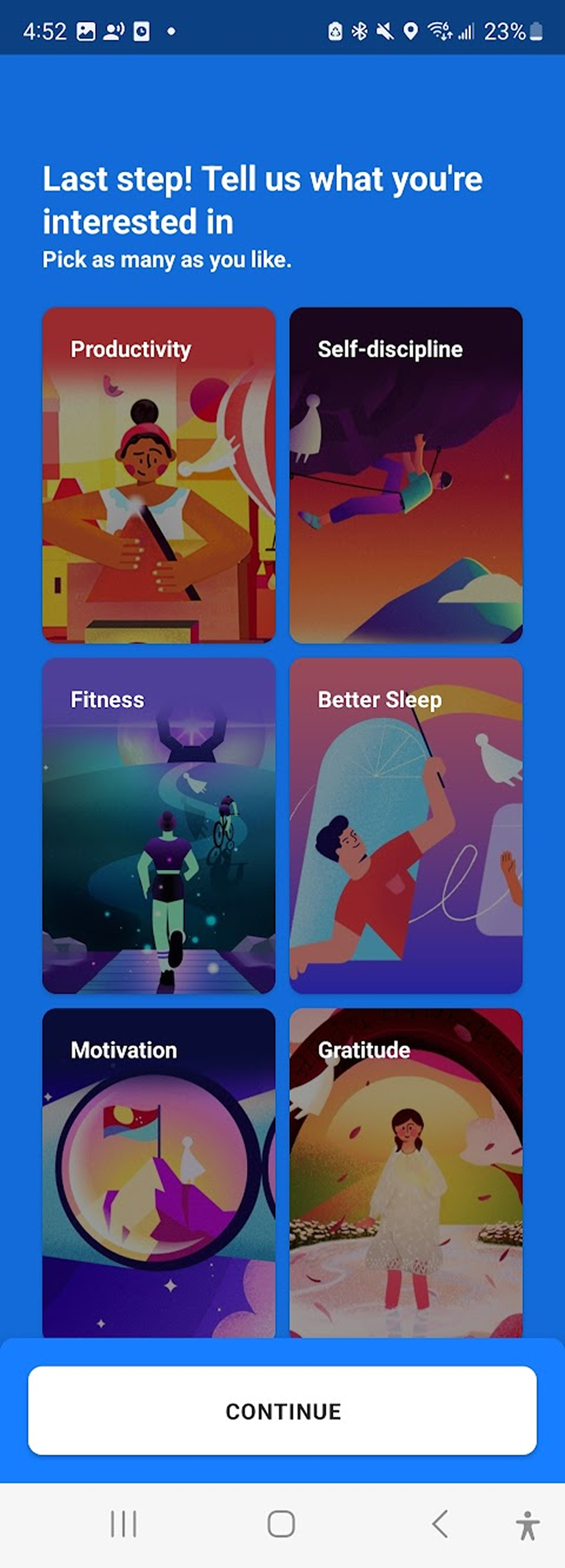
Motivation
Users needed visible progress and clear benefits to stay engaged. Apps like Duolingo use streaks and Headspace uses session counts. Both make effort feel rewarding before asking for commitment.
Trust
Asking for a phone number with zero context is a trust killer. Calm and Notion AI delay personal data collection until after the user has experienced something meaningful.
Discoverability
Entry points buried in menus kill participation. Amazon surfaces review prompts immediately after purchase. We had no surfacing strategy at all.
Competitor screenshots
Competitive analysis 1
Competitive analysis 2
Who we designed for
โšก
Priya, 31
Product Manager ยท New York
Busy professional

"I want to build habits but my calendar is already full."

โœ“ Wants 5-minute check-ins, not lengthy journaling
โœ“ Motivated by streaks and measurable progress
โœ— Drops apps that feel like more work to manage
๐Ÿƒ
Marcus, 26
Personal Trainer ยท Austin
Fitness enthusiast

"I train every day but sleep and recovery habits fall apart."

โœ“ Values data and wants to see patterns over time
โœ“ Likes a coach that pushes, not just nudges
โœ— Loses interest in apps that feel generic or soft
๐Ÿ”„
Leila, 34
Freelance Designer ยท Seattle
Habit restarter

"I've downloaded every habit app. I start strong, then ghost it."

โœ“ Responds well to a warm, non-judgmental tone
โœ“ Needs re-entry to feel easy, not like starting over
โœ— Shame-based reminders make her uninstall the app
How might we
"How might we design an onboarding experience that builds trust, provides clarity, and drives users to complete setup with confidence?"
05 โ€” Design Process

Three rounds of iteration, tracked in Amplitude after every ship

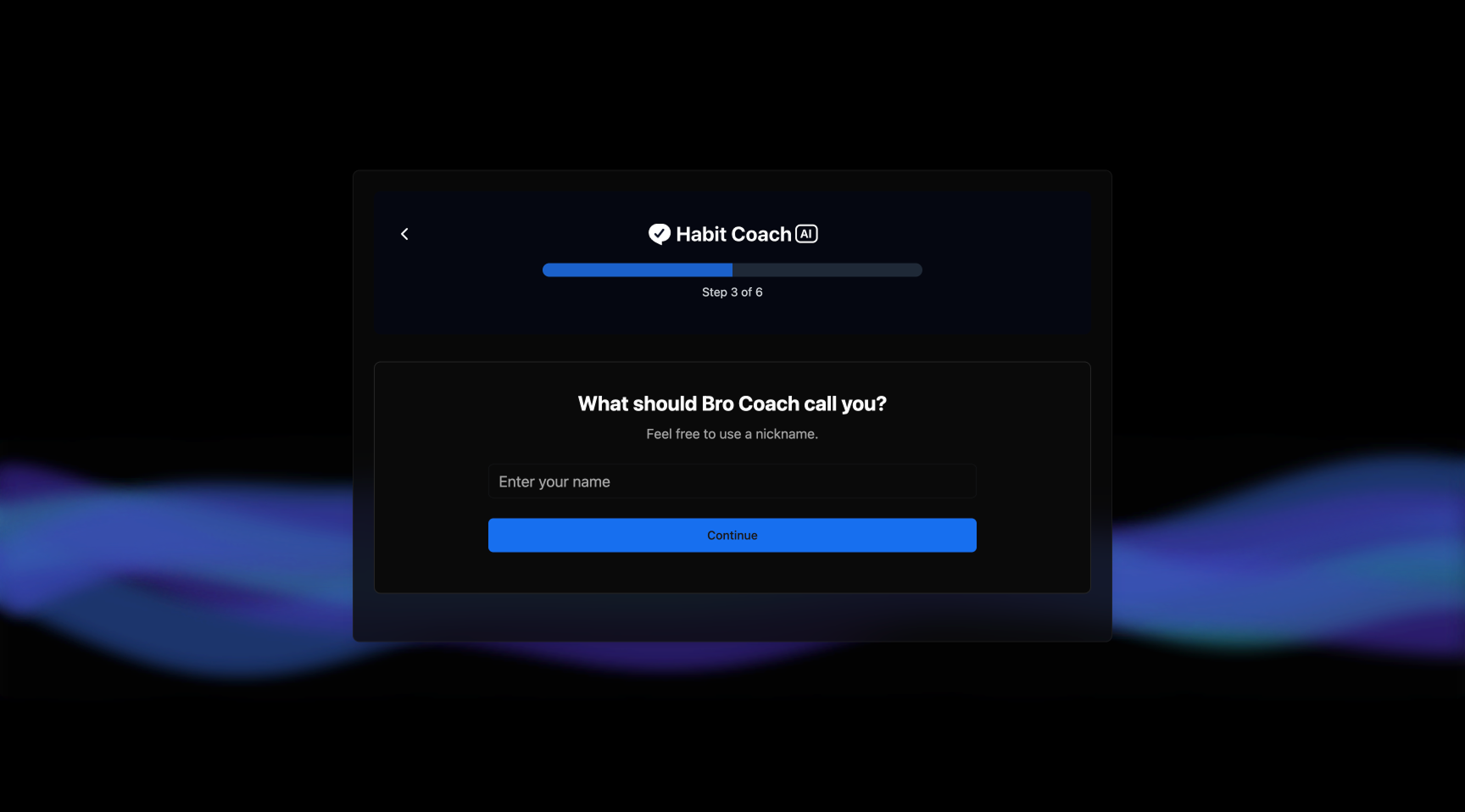
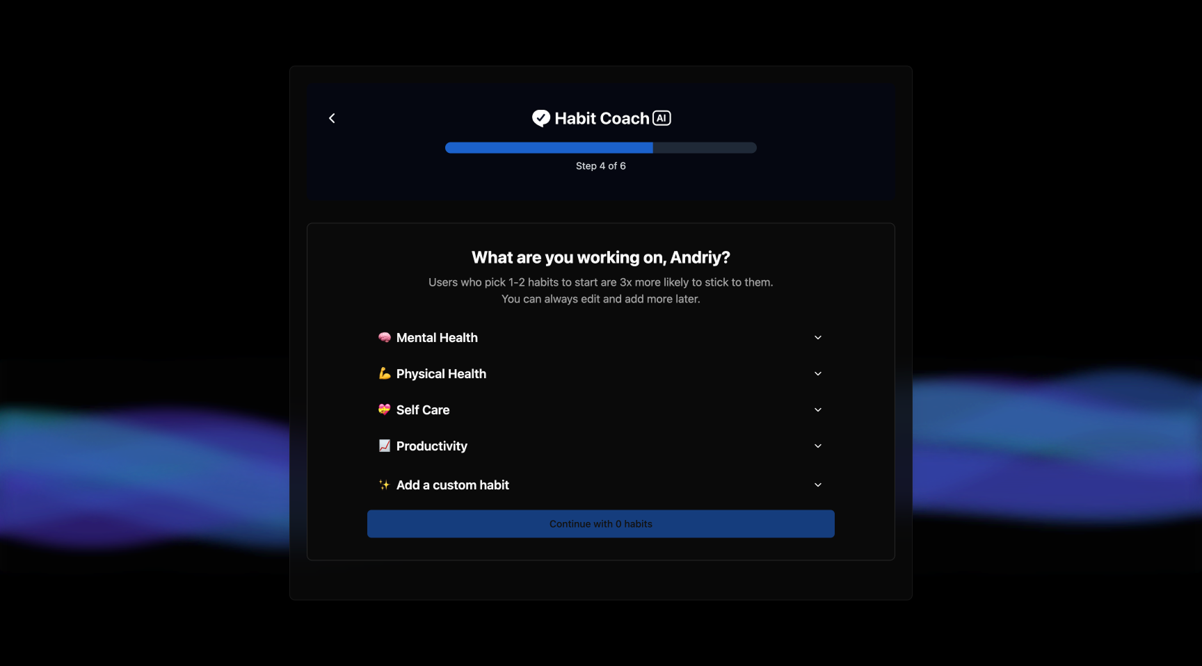
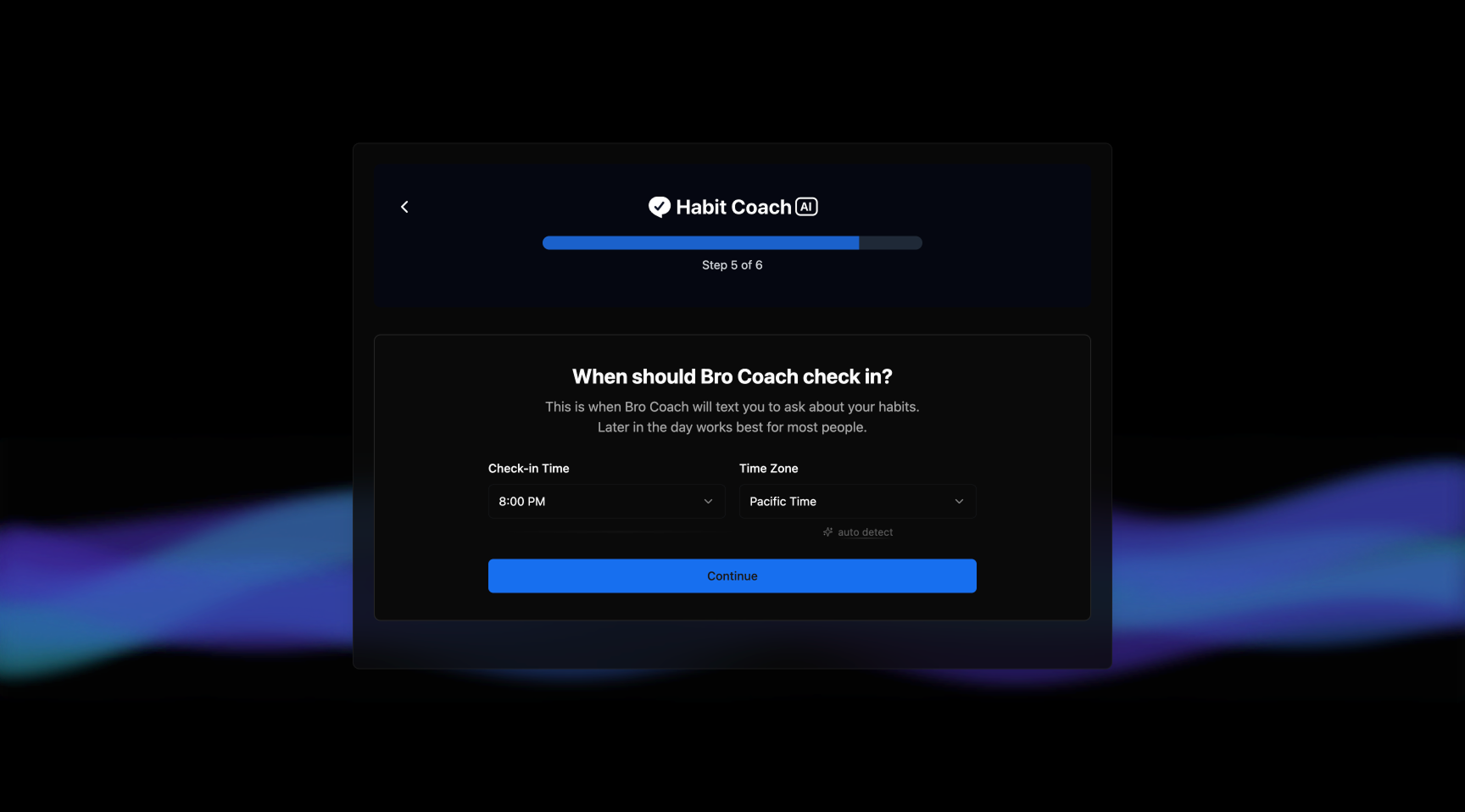
I didn't guess my way to the solution. I shipped, measured where users dropped off, identified the specific failure, fixed it, and shipped again. Here's what that looked like.
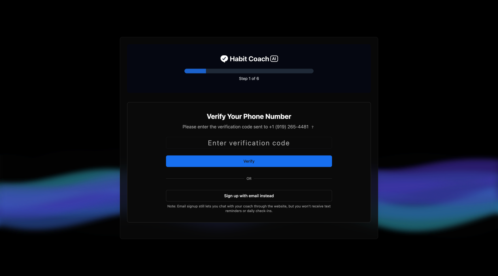
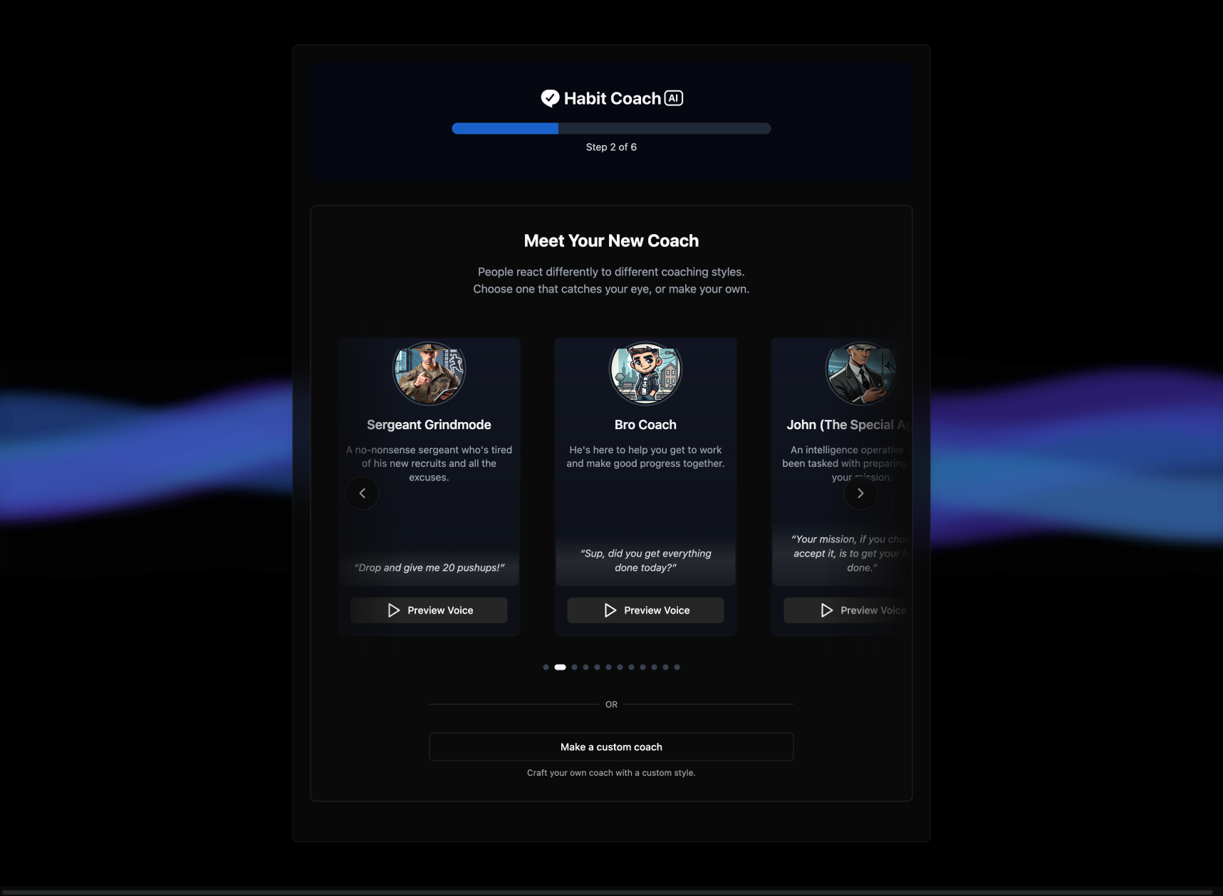
v1 โ€” Early flow ยท Wk 1
Early flow screen 1
Early flow screen 2
Early flow screen 3
Early flow screen 4
Early flow screen 5
1
2
3
4
5
Data from Wk 1
53% dropped at step 1
The phone number ask came cold. Users had no context for the product or why it needed their number. No trust had been built yet.
The tradeoff
Longer flow, higher trust
Moving the number ask to the end meant more steps. But users who got there were already invested. Completion rate mattered more than funnel length.
What changed
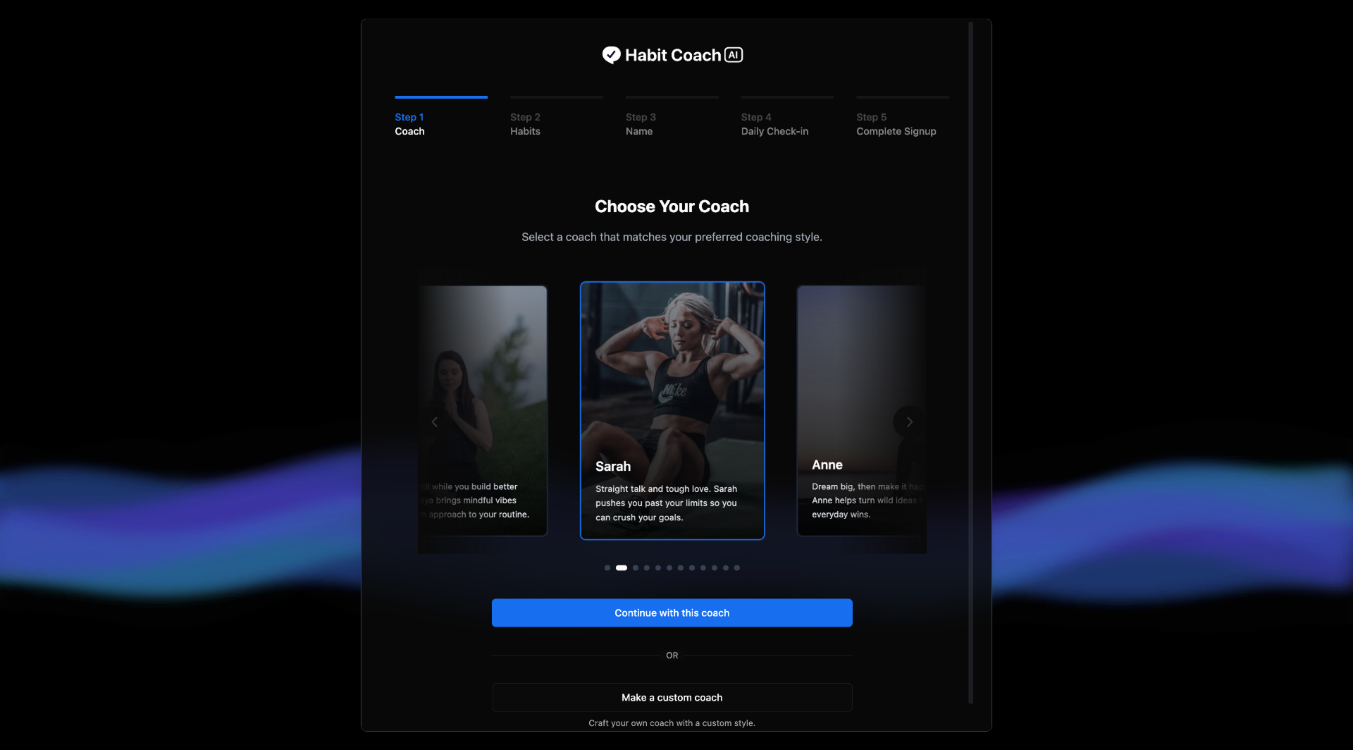
Coach selection first
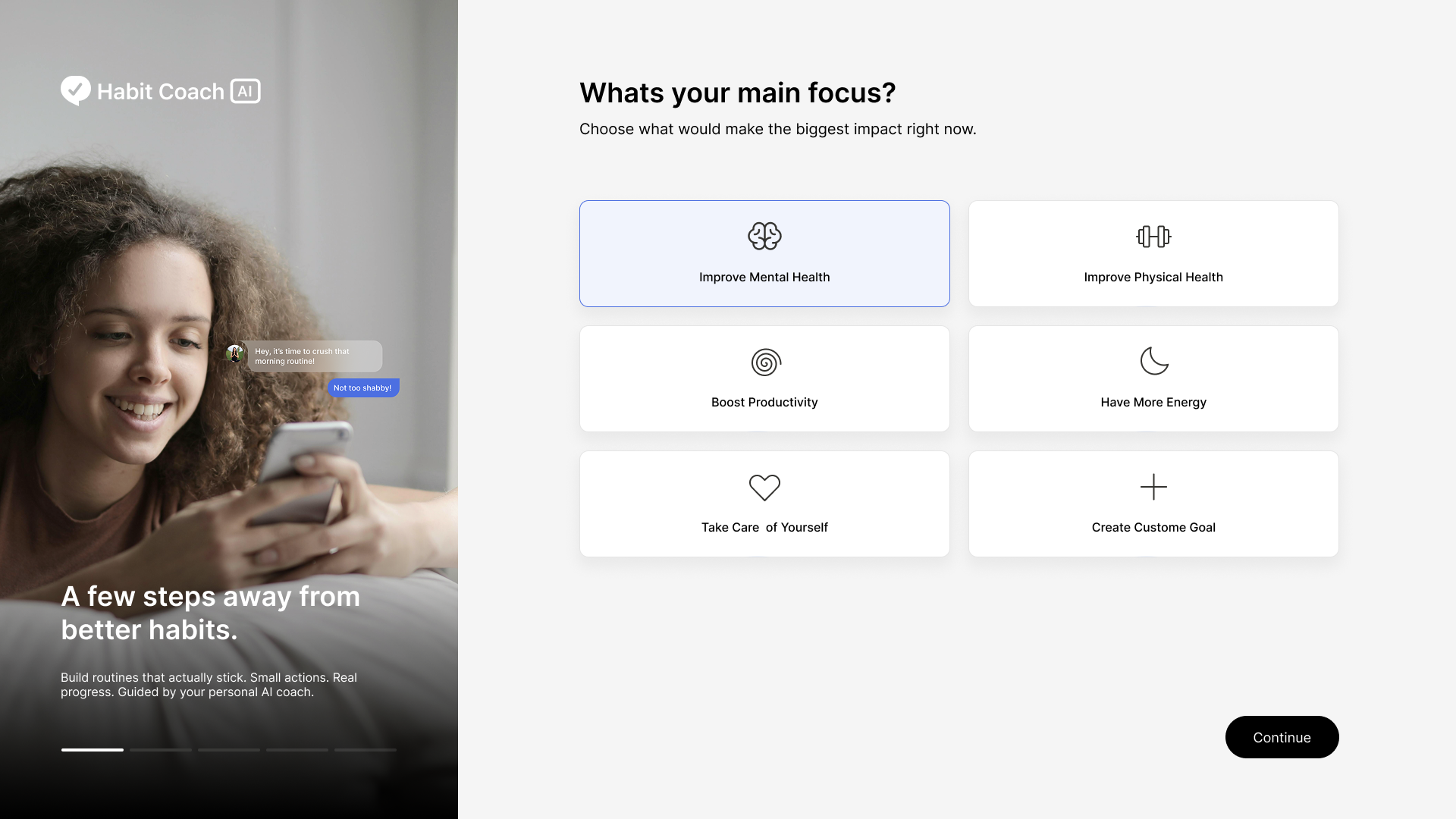
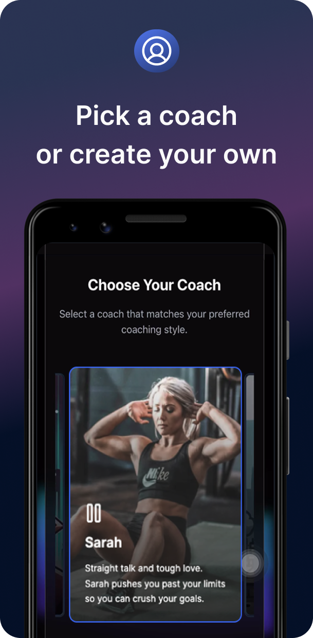
Opening with coach selection made the experience feel personal from tap one. The number ask at the end felt earned, not intrusive.
v2 โ€” Revised flow ยท Wk 2
Revised flow screen 1
Revised flow screen 2
Revised flow screen 3
Revised flow screen 4
Revised flow screen 5
1
2
3
4
5

Wk 3: Drop-off data pointed to four specific problems. No step clarity in the progress bar. Habit selection felt like being bucketed into a list. Coach cards were text-heavy. No clear way to connect with the AI.
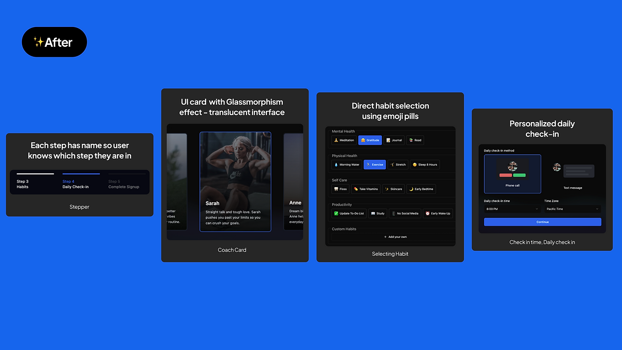
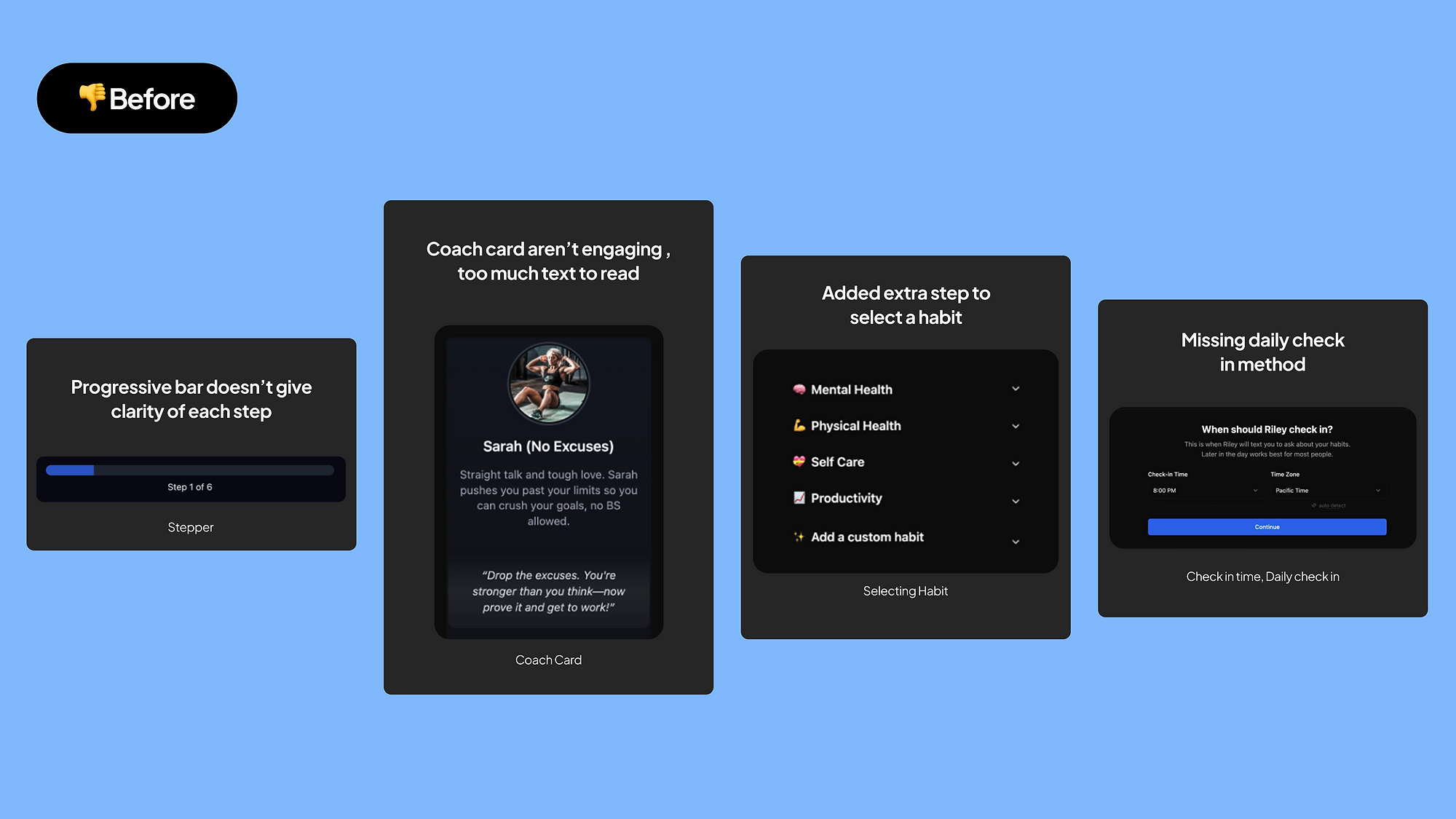
After redesign
Before redesign
โ‡”
Before After

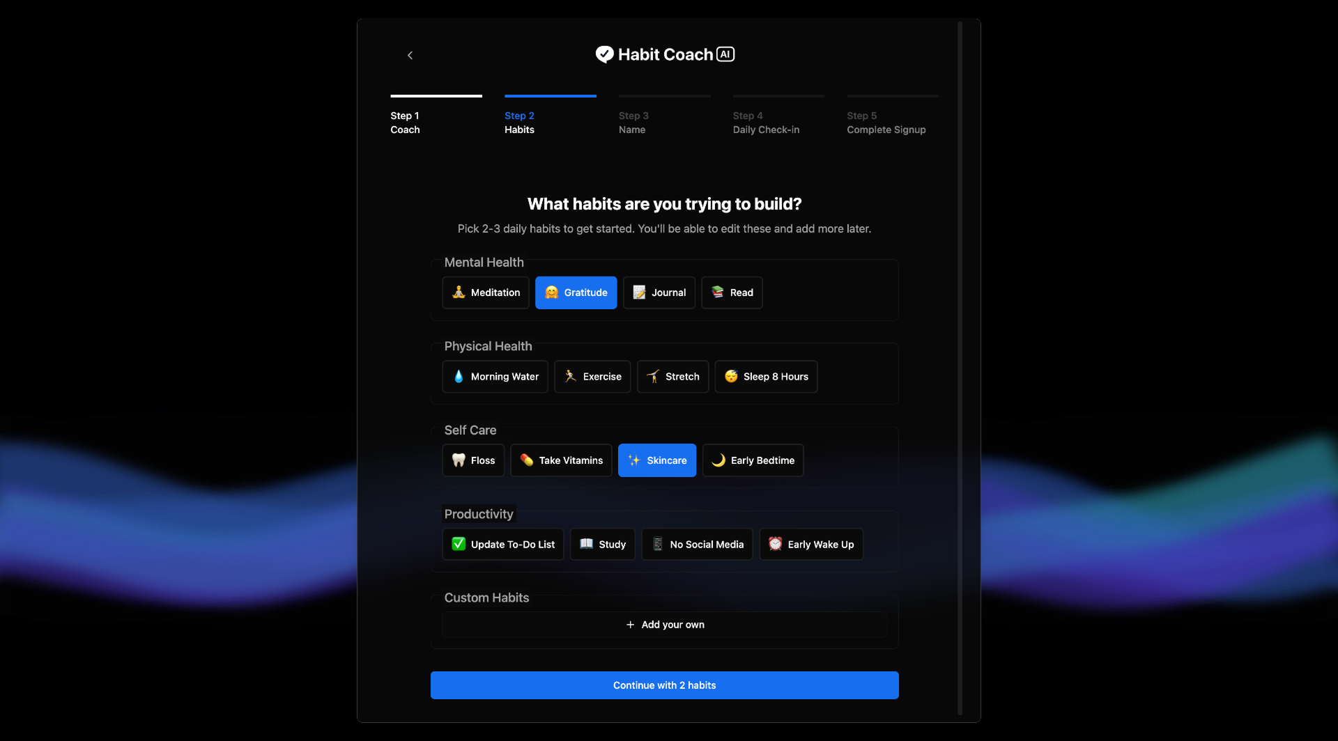
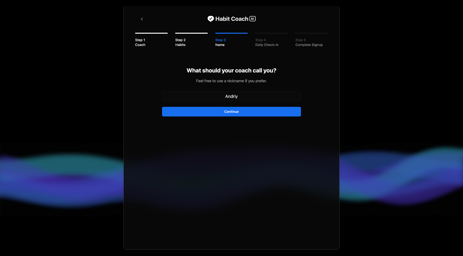
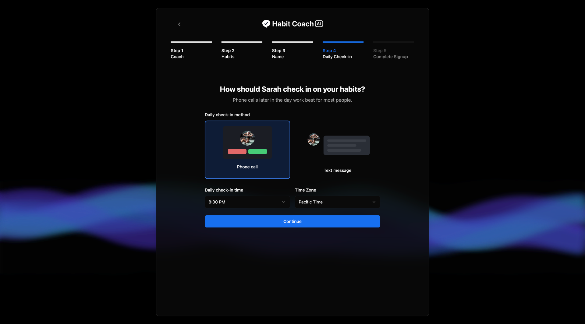
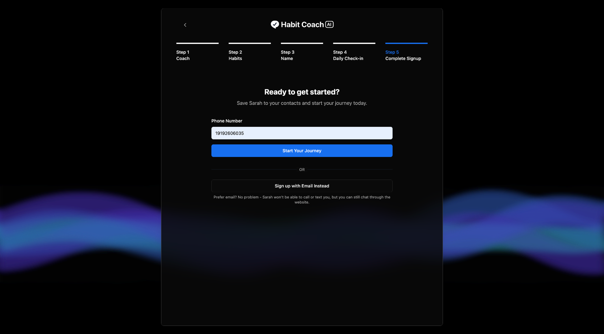
Wk 4: Shipped the redesign and tracked in Amplitude. Personality-first video coach cards replaced text. Visual icon grid replaced the list-style habit picker. Two connection options (call or text) removed a hard blocker. Drop-off at step 2 fell significantly.

06 โ€” Key Features

The four screens that changed everything

From a 95% drop-off to a product users return to daily. Each screen below represents a specific design decision that moved the metrics.
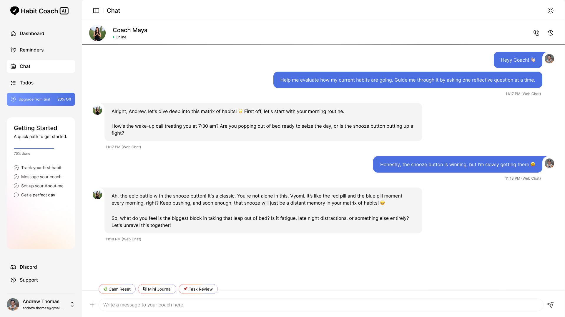
AI Chat & Voice

Conversational daily check-in that feels human

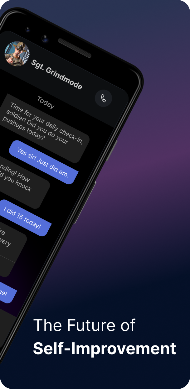
Designed the chat UI and voice call experience. The AI coach calls users proactively, tracks progress through conversation, and adapts tone to their coaching style.

AI chat interface
Habit Tracker

Calendar view, streaks, and emoji personalization

Replaced a Google Sheet backend with a proper visual tracker. Calendar view beat list view in testing. Light and dark modes built from day one because users check in at night.
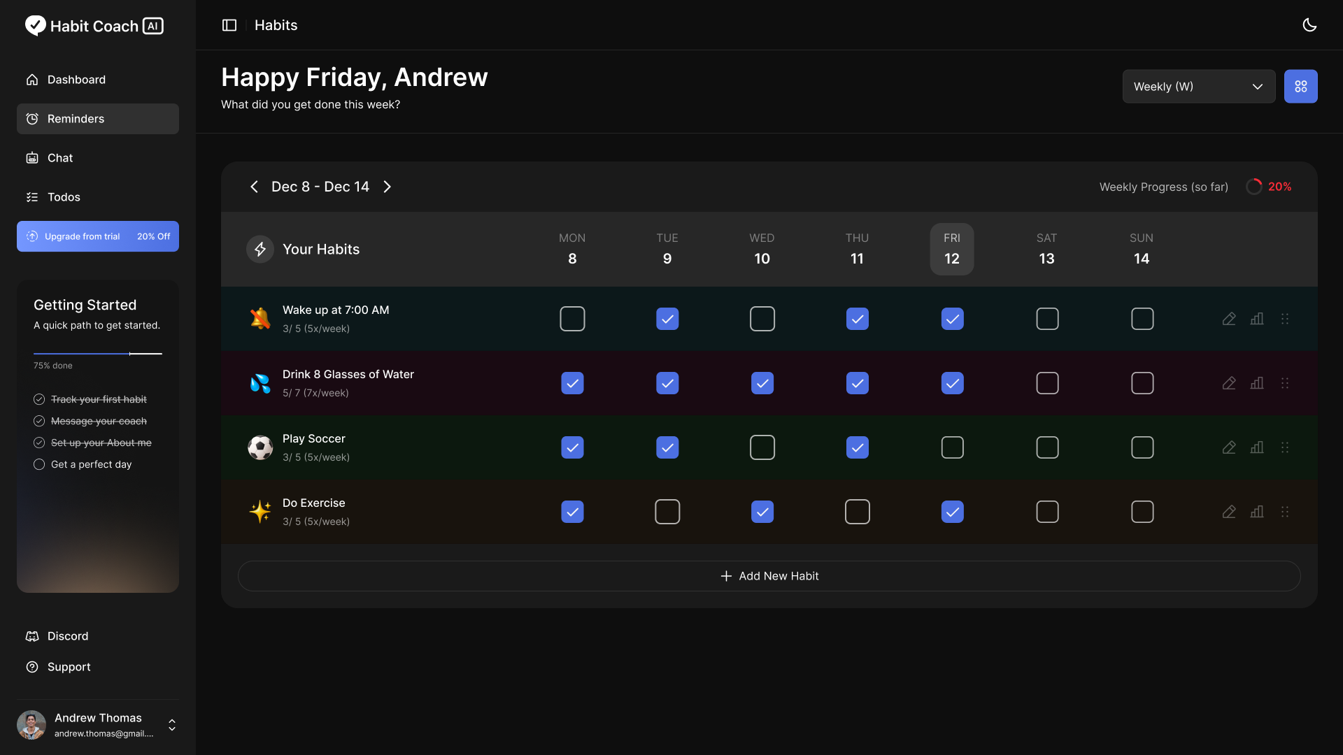
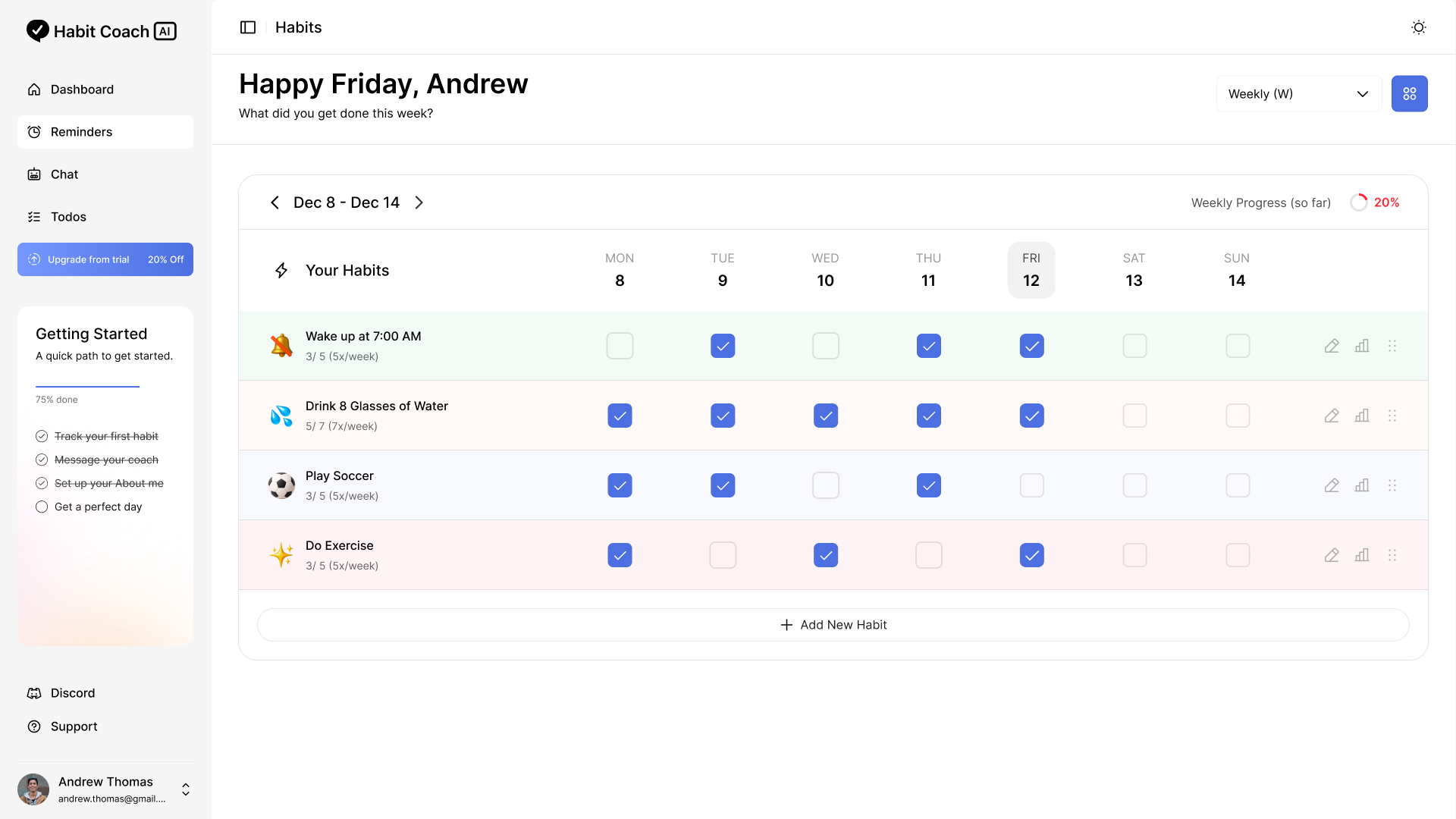
Dark mode
Light mode
โ‡”
Light mode Dark mode
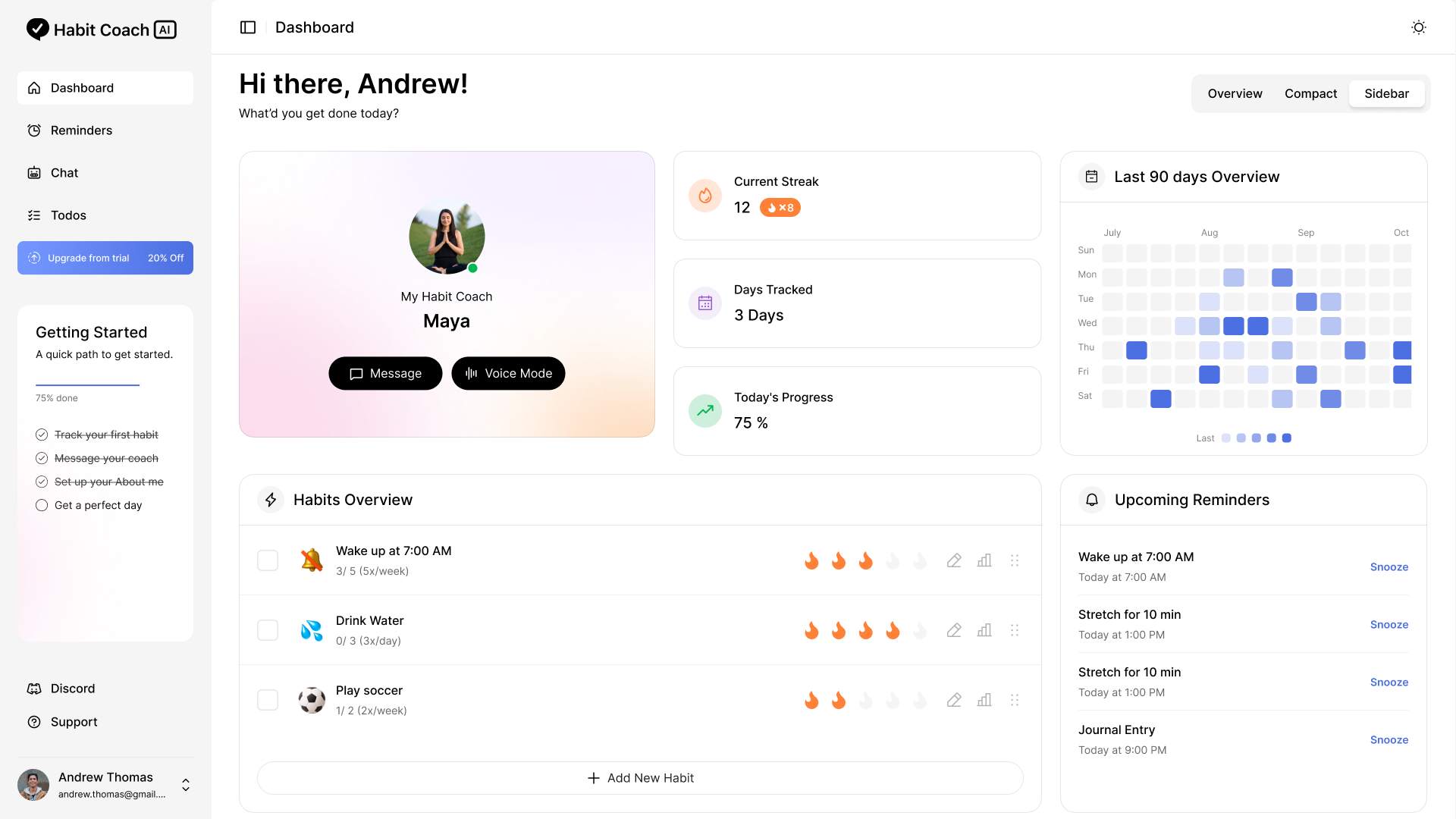
Dashboard

A new user flow I pitched, ideated, and vibe coded

Identified a gap in progress tracking, pitched a consolidated dashboard to the founders, vibe coded a prototype, and presented it. They implemented it in the next sprint.

Dashboard
Onboarding โ€” Final Solution

Personality-first coach cards, visual habit grid, step clarity

The redesigned onboarding opened with coach personality selection, replaced text lists with icon grids, added two ways to connect, and labeled every step. Overall conversion climbed to 42.7%, up 18.6%.

Most recent approach: vibe coded in Cursor and shipped as the product's primary light mode experience.

07 โ€” Design System

A design system built from zero, used in production from day one

I built the full Habit Coach AI design system in Figma while the product was actively being developed. Tokens first, components second, patterns third. Engineers pulled directly from the library.
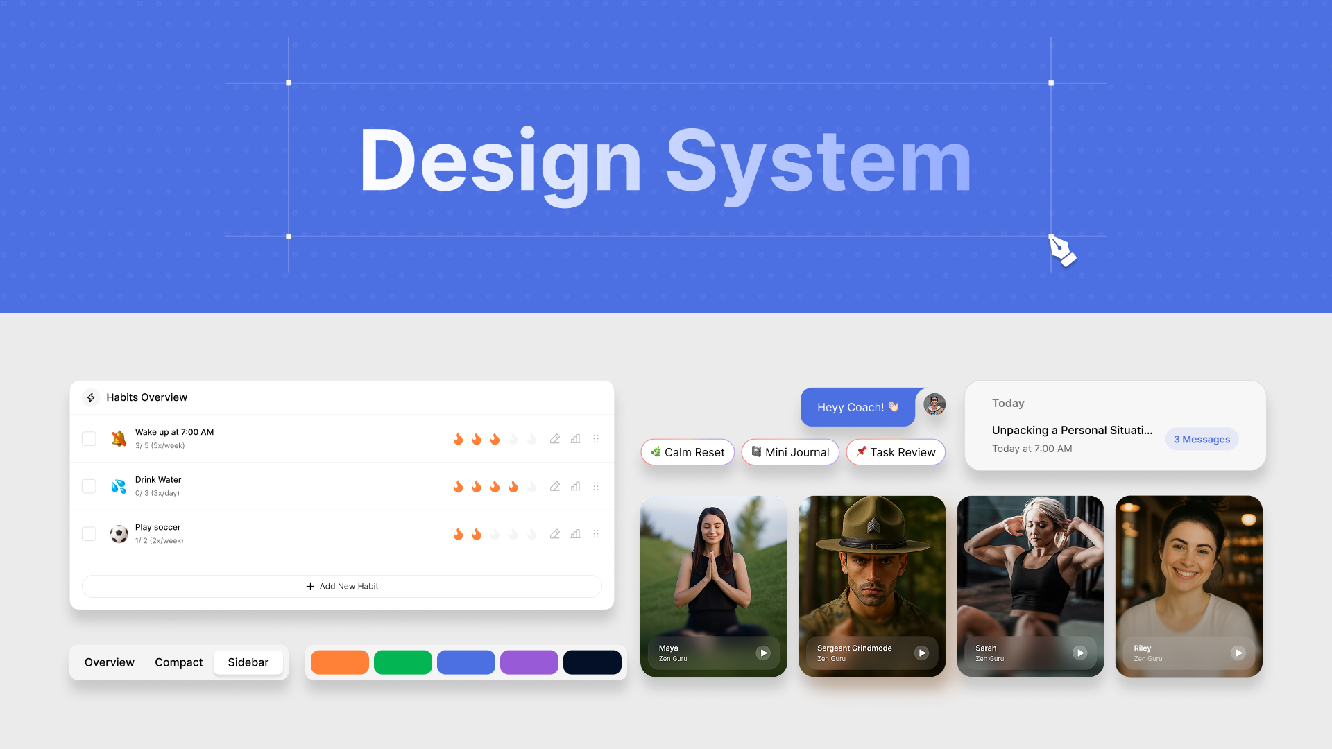
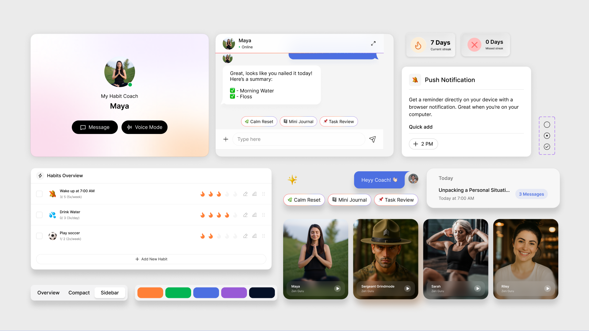
Dark mode as default
Built simultaneously with light mode, treated as the primary experience for evening users.
Indigo as the brand anchor
Used sparingly as the primary action color. Trustworthy and calm, not clinical or cold.
Personality through emoji
An emoji picker on habit cards: small call, high-satisfaction. Personalization builds ownership.
Design system overview
Design system components
1
2
08 โ€” Marketing Ads

Designed to convert, not just to impress

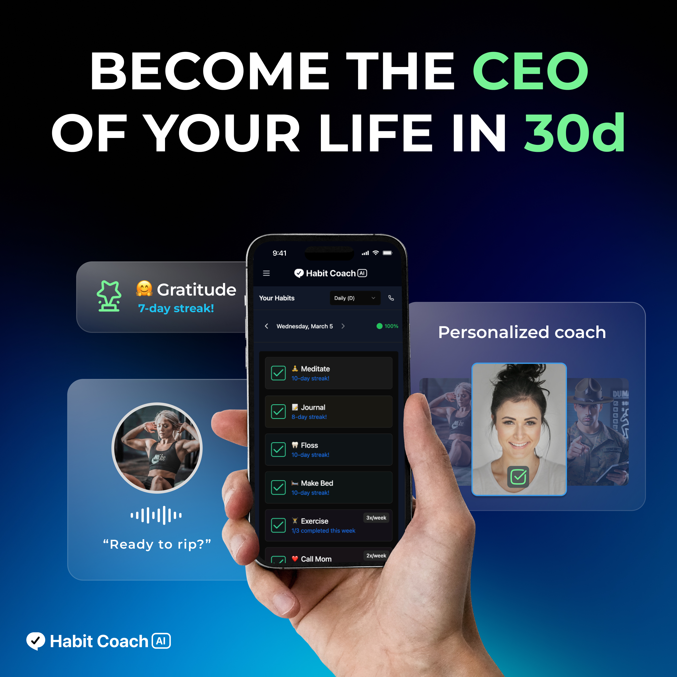
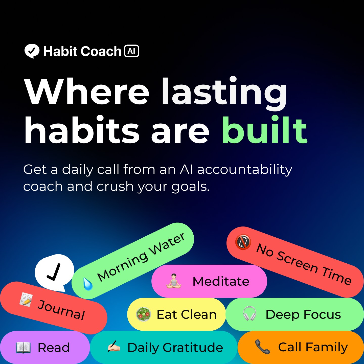
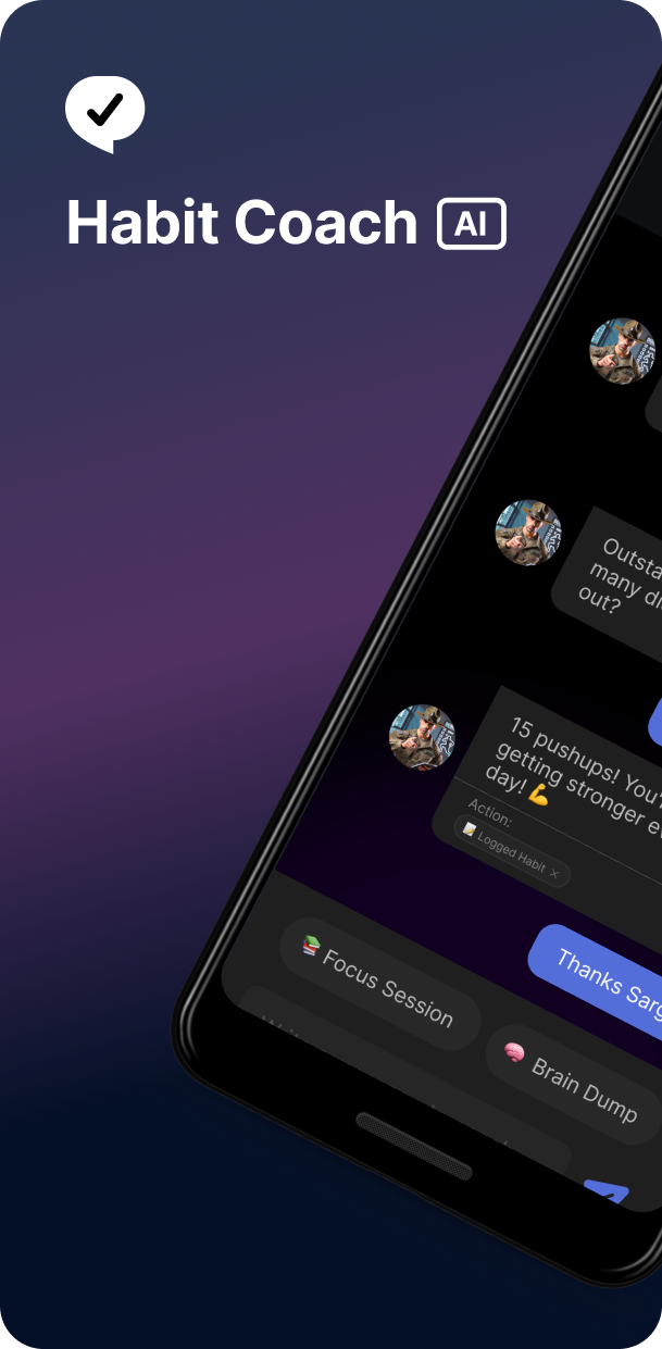
Beyond the product, I designed the ad creatives that brought users in. These ran on Meta, Instagram, and Google to 100k+ people, with Instagram story placement delivering the best conversion.
Google & Meta
1000ร—1000px post format
100k+ audience reach
1,600 click-to-onboarding signups
Become the CEO of your life in 30d
Where lasting habits are built
โœ•
Habit Coach AI ยท First Ad Campaign: Testing the Waters

Make someone stop scrolling in under 2 seconds

The campaign ran cold, no retargeting, no warm audience. The creative had to earn trust before anyone read a word of copy. We tested dark and light mode variants across placements. Instagram story was the clear standout, with the highest click-to-onboarding rate of any channel.

Instagram Story
Meta Feed
Google Display
Best conversion came from Instagram dark mode story placement. Users from this channel completed onboarding at the highest rate of any traffic source.
09 โ€” Impact

Built from zero, shipped to real users, measured in Amplitude

From the ad campaigns that drove discovery to the onboarding redesign that converted users, every decision was tracked. These numbers reflect the full product lifecycle.
0
Users acquired
From 0 in 90 days
0
Audience reached
Meta, Instagram & Google
0
Conversion rate
Up 18.6% after redesign
0
Onboarding completion
Up from near-total drop-off
App Store screenshot 1 App Store screenshot 2 App Store screenshot 3 App Store screenshot 4 App Store screenshot 5
Google Play Store images designed
10 โ€” Learnings

What I'd tell the designer who walked into that first day

โšก
Ship smaller, measure faster
Tight 1-week cycles beat big redesigns every time. Data from week 1 told me exactly what week 2 needed to fix.
๐Ÿค
Trust is a design problem, not a copy problem
The real fix was structural: delay the risky ask, show value first. That's a layout decision, not a word decision.
๐Ÿงฑ
A design system is worth the upfront investment
By month 3, engineers were shipping new screens with zero back-and-forth. The time saved in reviews was worth 3x the build time.
๐Ÿงญ
Being first means deciding what "done" looks like
No design org, no review process, no historical reference. I had to build the judgment calls and the process to evaluate them at the same time.