Health Tech Dashboard Design Enterprise Web

Designing intuitive dashboards for
pharma sales teams

Senior Visual Product Designer at ZS Associates, where I led the design of ZAIDYN's Multi-Platform Incentives Dashboard, used daily by 45,000+ field reps across 70+ countries.

Role
Senior Visual Product Designer
Duration
Feb 2021 โ€“ Jul 2023
Team
1 PM ยท 1 Design Head ยท 2 UX Designers ยท 15 Engineers
Platform
Web ยท Enterprise SaaS
About ZAIDYN

An AI-powered enterprise platform built for pharma field teams

ZAIDYN is ZS's AI-powered enterprise platform for pharma and life sciences, consolidating CRM, sales performance, and incentive data for field teams across 70+ countries.

I joined as Senior Visual Designer to redesign the Multi-Platform Incentives Dashboard, used daily by 45,000+ reps, from friction mapping to production specs.

Areas I worked on during this product launch
Full case study below on the Incentives Dashboard. Other features are under NDA.
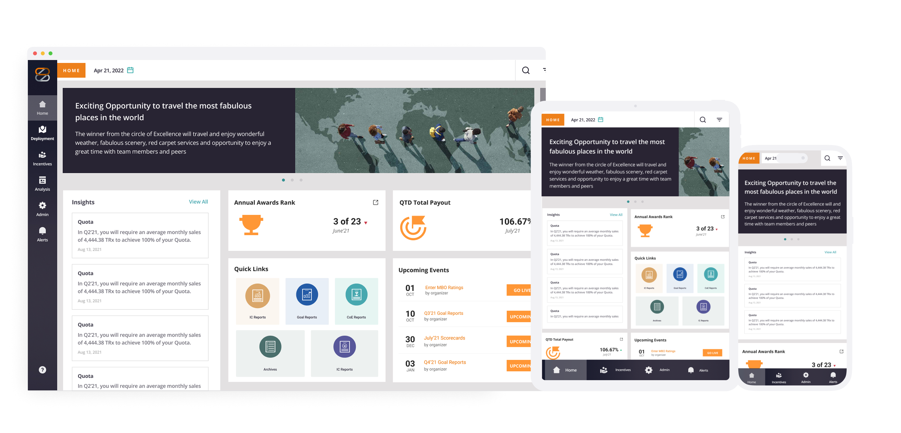
Multi-Platform Incentives Dashboard
Multi-Platform Incentives Dashboard. Full case study below โ†“
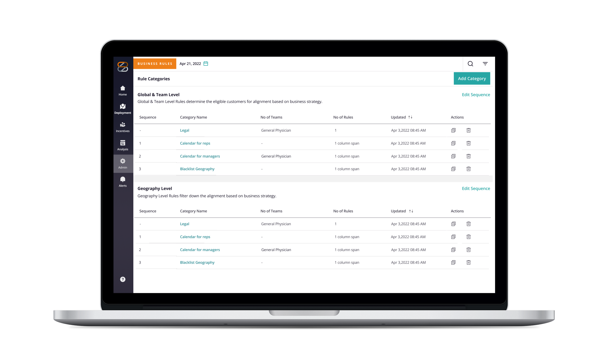
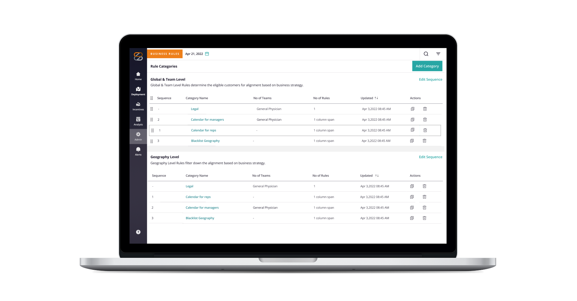
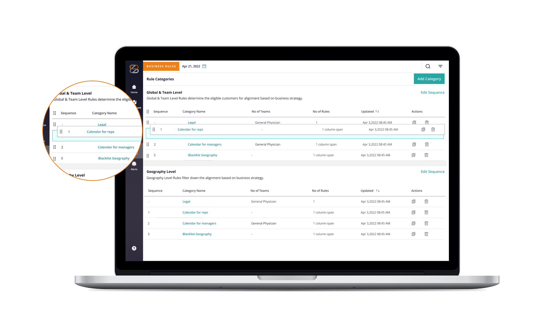
Business Rules Editor
Draggable, editable columns in Business Rules Editor
NDA
Interactive Data System
Interactive data system with multi-state indicators and smart filtering
NDA
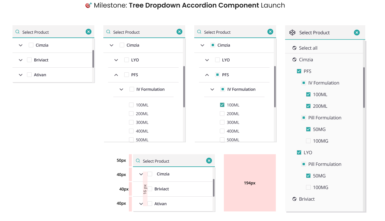
Tree Dropdown Accordion Component
Tree Dropdown Accordion Component Launch
NDA
NDA note
Detailed work on the Business Rules Editor, data systems, and component launches can't be shared publicly. Reach out at vyomika@gmail.com for a walkthrough.

01 โ€” Multi-Platform Incentives Dashboard

Unifying performance data into a single, actionable view

Sales data, incentive progress, and goal tracking lived in separate tools. A field rep checking their quarterly performance had to navigate multiple systems, with numbers that rarely matched and no single place to act on what they found.

Without a unified view, tracking progress was slow and error-prone. Managers couldn't spot struggling reps in time. Executives lacked a reliable signal. Reps stopped trusting the data.

< 30%
Weekly active usage among field reps. Most had abandoned the dashboard entirely before the redesign.
3+
Separate systems reps navigated daily just to check their performance, payouts, and rankings.
1 in 3
Reps reported incentive discrepancies due to mismatched data across disconnected tools.
How might we
"How might we provide field teams real-time insights and personalized incentives to boost operational effectiveness?"
01
Discovery
Collaborated with PMs and the Head of UX to define requirements, gather design constraints, and map existing user workflows and stakeholder expectations.
02
Analysis
Walked through pre-developed screens to audit the current dashboard, identifying gaps between what reps expected from the tool and what it actually surfaced.
03
Friction Mapping
Identified 4 critical usability gaps in the existing experience that were creating daily barriers for field reps. These became the brief for the redesign.
Missing visual hierarchy
Key elements like the "Welcome Report" occupied prime real estate but didn't stand out. Critical performance data was buried alongside secondary content with equal visual weight.
Overcrowded sections
Resources and Report Links were dense with links and labels, making navigation overwhelming. Reps rarely explored beyond the default view because everything looked the same.
No clear focal point
Too many elements competed for attention at once. Reps had no obvious entry point and had to scan the full page just to locate their quota or payout progress.
No personalization
Notification widgets showed generic, one-size-fits-all content. Reps tuned them out entirely. Nothing surfaced was relevant to their current goals or performance period.
Design Approach

Redesigning around how reps actually work

Three principles shaped every decision, from information hierarchy to component-level interactions.

Surface what matters
Quota progress, payout status, and rankings move above the fold. Everything else steps back.
Reduce cognitive load
Organize data by rep workflow, not system structure, so the next action is always obvious.
Build for trust
Real-time, consistent data reps rely on, reducing escalations and manual cross-checks.
ZAIDYN Dashboard
Performance
Awards & Rankings
QTD Payout
Quota Progress
Content
Slider Banner
Insights Feed
Announcements
Navigation
Quick Links
Upcoming Events
Report Links

Mapping the dashboard

Guided by the three principles, I restructured the dashboard into three clear zones, each with a defined job for the rep.

1.
Performance zone: quota progress, rankings, and payout figures surface immediately on load.
2.
Content zone: slider banner and insights feed replace the cluttered notification widget with a scannable feed.
3.
Navigation zone: quick links and upcoming events give reps one-tap access to their most-used tools and commitments.
4.
Orange nodes are the 5 redesigned components. Each resolves a specific friction point identified in the audit.

Wireframes built from the friction points above, reviewed and iterated with the PM and Head of UX before moving to high-fidelity.

Before โ€” Existing dashboard
Asset needed
Screenshot of the original ZAIDYN dashboard before the redesign
What we found
Noise, not signal
Every widget competed equally. Reps couldn't tell what mattered most. The redesign needed a clear visual priority order before adding anything new.
The tradeoff
Less content, more clarity
Removing elements felt risky for an established product with daily users. We focused on reorganization first: same data, structured around how reps think about their day.
What changed
Performance metrics first
Quota progress, payout figures, and rankings moved above the fold. Secondary content remained accessible but no longer competed for primary attention.
Wireframes โ€” Revised layout
ZAIDYN dashboard wireframes

5 redesigned components, each resolving a specific friction

01 โ€” Slider Banner
Giving time-sensitive content the prominence it deserves
Resolves: product updates buried in text-heavy sections, reps missing announcements
Slider Banner โ€” ZAIDYN Dashboard
Clickable banner links directly to the event or feature page, reducing steps from awareness to action
Full-width format gives visual weight to time-sensitive content without cluttering other sections
Image + text pairing improves scannability so reps identify relevance at a glance without reading the full copy
02 โ€” Insights
Turning a noisy widget into a scannable feed
Resolves: overcrowded layout, lack of hierarchy in secondary content
Insights โ€” ZAIDYN Dashboard
Removed embedded charts: performance data has its own dedicated widgets, and the insights feed should read, not visualize
Hierarchical structure added: subject โ†’ heading โ†’ date, so reps can scan without opening each card
Individual cards made clickable with a "View All" escape hatch for power users who want the full feed
03 โ€” Annual Awards & QTD Total Payout
Making rankings and payout status legible at a glance
Resolves: no clear focal point, reps unable to gauge performance trend without digging
Annual Awards and QTD Payout โ€” ZAIDYN Dashboard
P&L color conventions with directional arrows: green/red + โ†‘โ†“ makes delta readable without parsing raw numbers
Quarter-to-date timeline replaced the static figure so reps see progress against the current period, not just a snapshot
Design system icons maintained platform consistency and reduced one-off asset overhead
04 โ€” Quick Links
Reducing navigation friction for frequently-used tools
Resolves: overcrowded link sections that discouraged interaction
Quick Links โ€” ZAIDYN Dashboard
Grouped icon layout with visible background separates Quick Links visually, making the section feel like a tool palette rather than more content
Enlarged icons with center-aligned labels are easier to scan and tap on lower-resolution screens common in field settings
Individual icons independently clickable; previously required navigating to a sub-page just to access a tool
05 โ€” Upcoming Events
Surfacing relevant events without cluttering the primary view
Resolves: no personalized or role-relevant content visible by default
Upcoming Events โ€” ZAIDYN Dashboard
Date-month-event structure organized by organizer so reps parse upcoming commitments in seconds without opening a calendar
RSVP action button in context so the action is available where the event is surfaced, not buried in a separate module
Logo color coordination applied for quick visual recognition of event organizers

The results

45,000+
Field reps now track performance through a single unified view
$2.5B+
In annual payouts managed with greater clarity and fewer escalations
75%
Of business users reported increased efficiency following the redesign

What I owned on this project

โ†’
Mentored incoming designers
Reduced onboarding time for new team members by helping them ramp on ZS design standards, freeing the rest of the team to stay focused on shipping.
โ†’
Led visual design end-to-end
Owned the Incentives Dashboard from friction mapping through production-ready high-fidelity specs, including all 5 redesigned components.
โ†’
Partnered with product leadership
Worked directly with the Sr. Director of Product Management and engineering leads to translate requirements into quality designs without late-stage revision cycles.
โ†’
Managed cross-PM design timelines
Provided work estimates and coordinated design delivery across multiple concurrent product workstreams simultaneously.

What I took away from this project

01
Enterprise users are power users. Design for density, not simplicity
Field reps didn't want fewer features. They wanted the same data, organized so they could find what they needed in under 10 seconds. Hierarchy was the real ask.
02
Hierarchy is the feature
The biggest wins came from removing visual noise, not adding new elements. A single clear focal point outperformed any new widget we could have introduced.
03
Stakeholder alignment shapes design as much as user research
Working closely with PMs from the start meant direction was grounded in user needs and business constraints both. Fewer late pivots, more confident execution.